Timeline
Project type
Role
Methods
Overview
The Field Museum located in Chicago, attracts over 1 million visitors annually. The website for the Field Museum allows users to purchase tickets, discover about the exhibits inside, and much more but it was still confusing to even buy a ticket. The main reason was that the site mixed task and topic based navigations. Our goal was to refine the information architecture so visitors and researchers could more easily find what they needed.
We conducted a content inventory, heuristic analysis, card sorts, and tree tests to understand how people expected the site to be organized.
These methods revealed where users’ mental models diverged from the existing structure. Using those findings, we reorganized the site into clearer top-level sections. and resolved ambiguous items through a tested sitemap. Finally, we translated the new IA into focused wireframes for the ticket purchase flow and exhibitions, consolidating key actions into single, scrollable pages aligned with the new navigation. This led to higher tree-test success rates for finding exhibits, parking, and learning resources, and a more intuitive mobile experience overall.
Introduction
What is the Field Museum? The Field Museum located in Chicago, Illinois. The museum itself attracts over 1 million visitors annually. The website for the Field Museum allows users to purchase tickets, discover about the exhibits inside, and learn about the museum’s conservation efforts. The Problem: While the main structure worked well initially, deeper exploration revealed disorganized and repetitive content. We aimed to create a clearer, more intuitive experience that helped users find what they needed effortlessly. Our Goals: Our goal was to enhance the Field Museum’s mobile website by improving its information architecture and simplifying how visitors navigate it.
Research Journey
Process Flow
1. Content Inventory 2. Heuristic Analysis 3. Card Sorting 4. Tree Testing 5. Sitemap and Wireframe This specific flow moves from understanding content → understanding users’ categories → validating navigation → embodying it in layouts, which produces evidence‑based, user‑centered IA. This way, it lets us answer questions about the information architecture in a logical order and keeps us from designing the structure blindly.
Content Inventory
The current Field Museum mobile website is broken down into 6 major content areas in the hamburger menu. (Visit, Learn, Events, Our Science, Get Involved, About). All links lead to an HTML-based page
We found that many of the categories like Our Science had extremely deep sub-menus. Many of the links in Our Science lead to external websites.
The issue we found was the overall amount of redundant content. In almost every page was either a link or additional navigation bar.

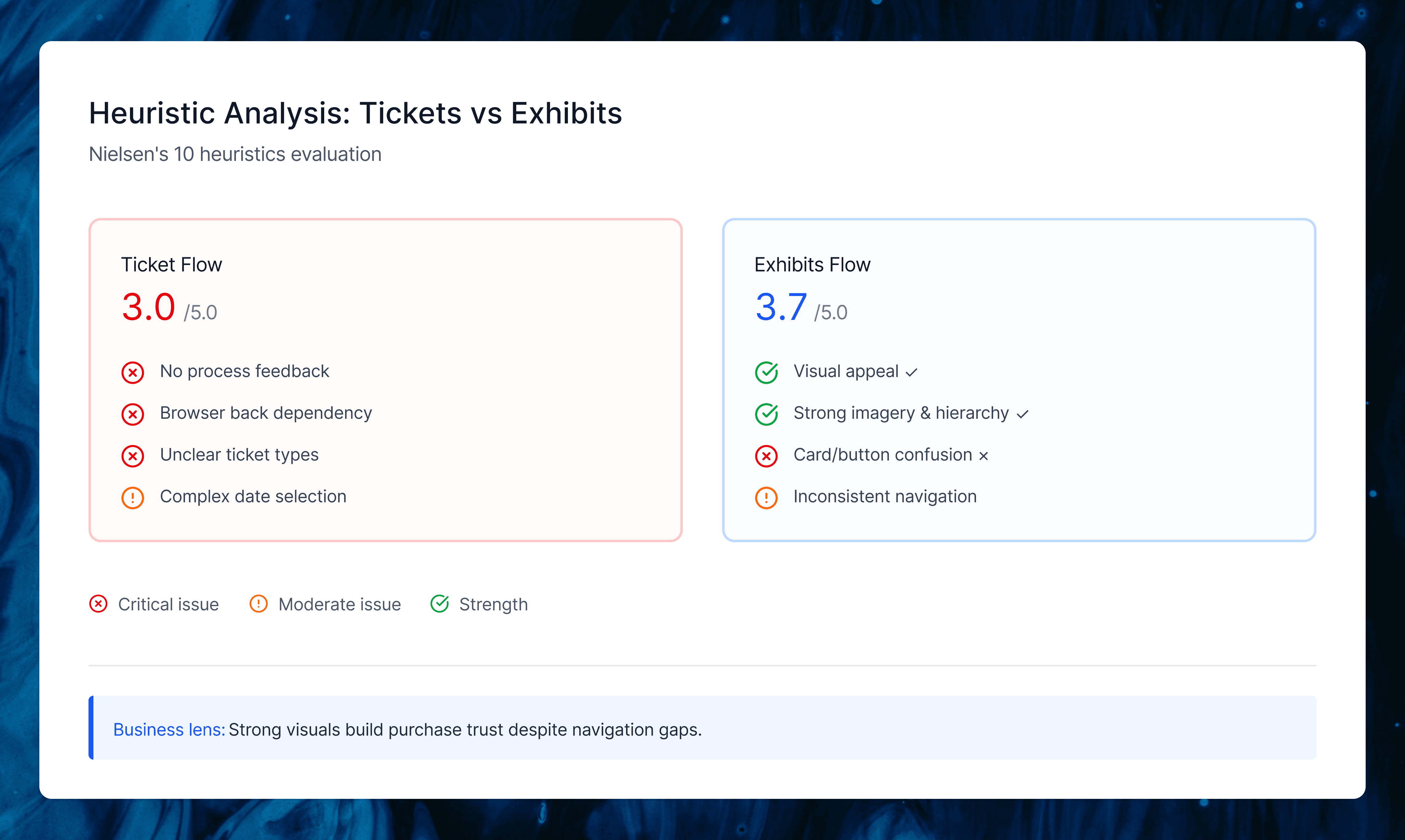
Heuristic Analysis
We evaluated two critical user flows on the Field Museum’s mobile site: purchasing tickets (average score 3/5) and finding current exhibitions (average score 3.7/5). The ticket flow struggled with mental model support.
Users couldn’t tell their step in the buying process, ticket types lacked clear explanations, and there were no in-app navigation options (forcing browser back buttons that reset selections). Exhibitions worked better visually but confused card vs. button interactions and failed to indicate which required extra fees.
My Unique Perspective
My teammates focused purely on user task completion, but I looked at it through a business lens—how well did the IA actually drive ticket sales, the museum’s main revenue stream? This made me rate visual consistency and design standards higher since they build purchase trust, even while calling out navigation gaps that hurt conversions. We had great debates about this, which helped us land on recommendations that served both users and the museum’s goals.
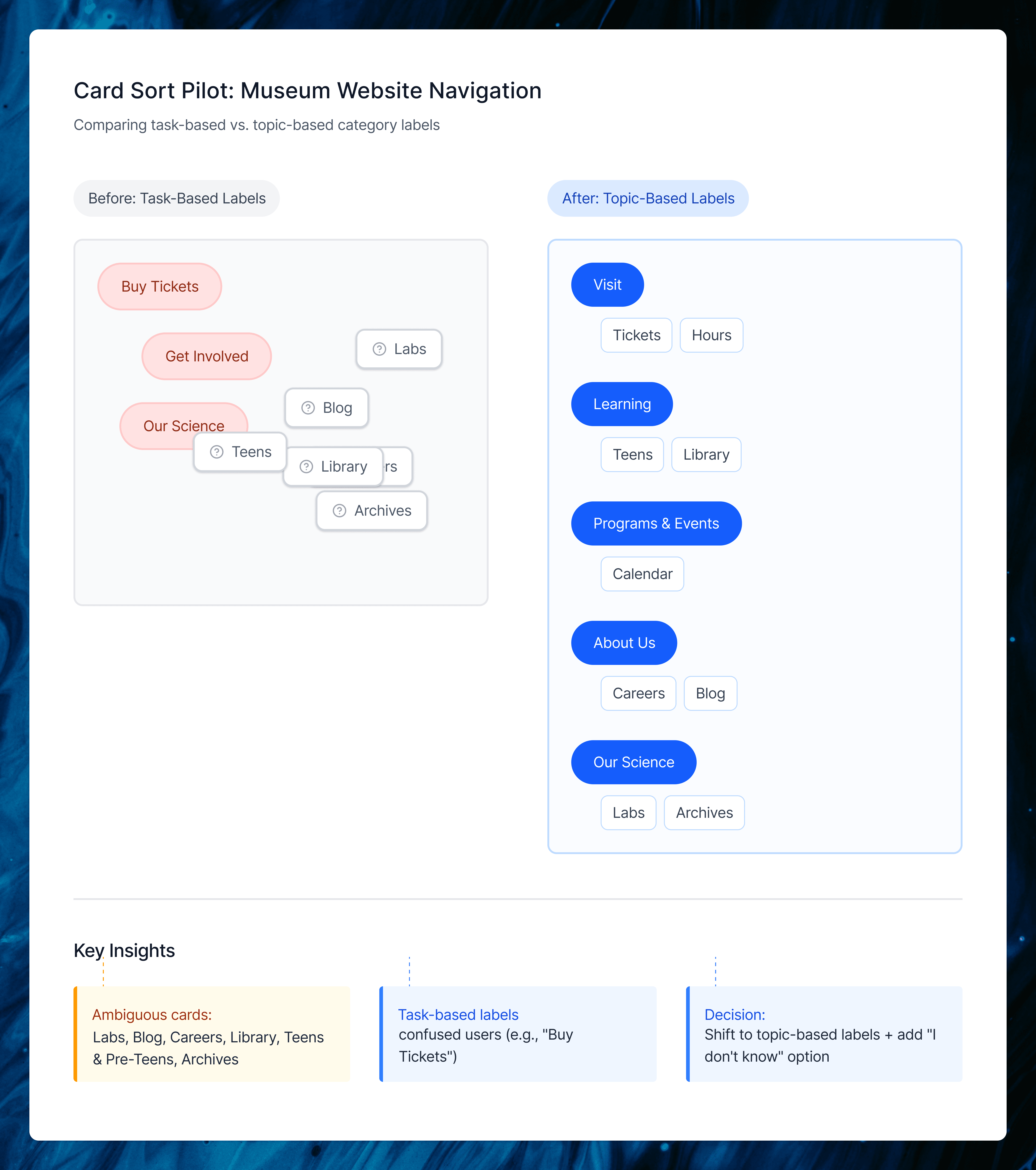
Card Sorting
Card Sorting helped us understand how people naturally expected the Field Museum’s content to be grouped and named. We ran a pilot and two closed card sort rounds, using each step to clean up confusing labels and bring our IA closer to real visitor mental models.
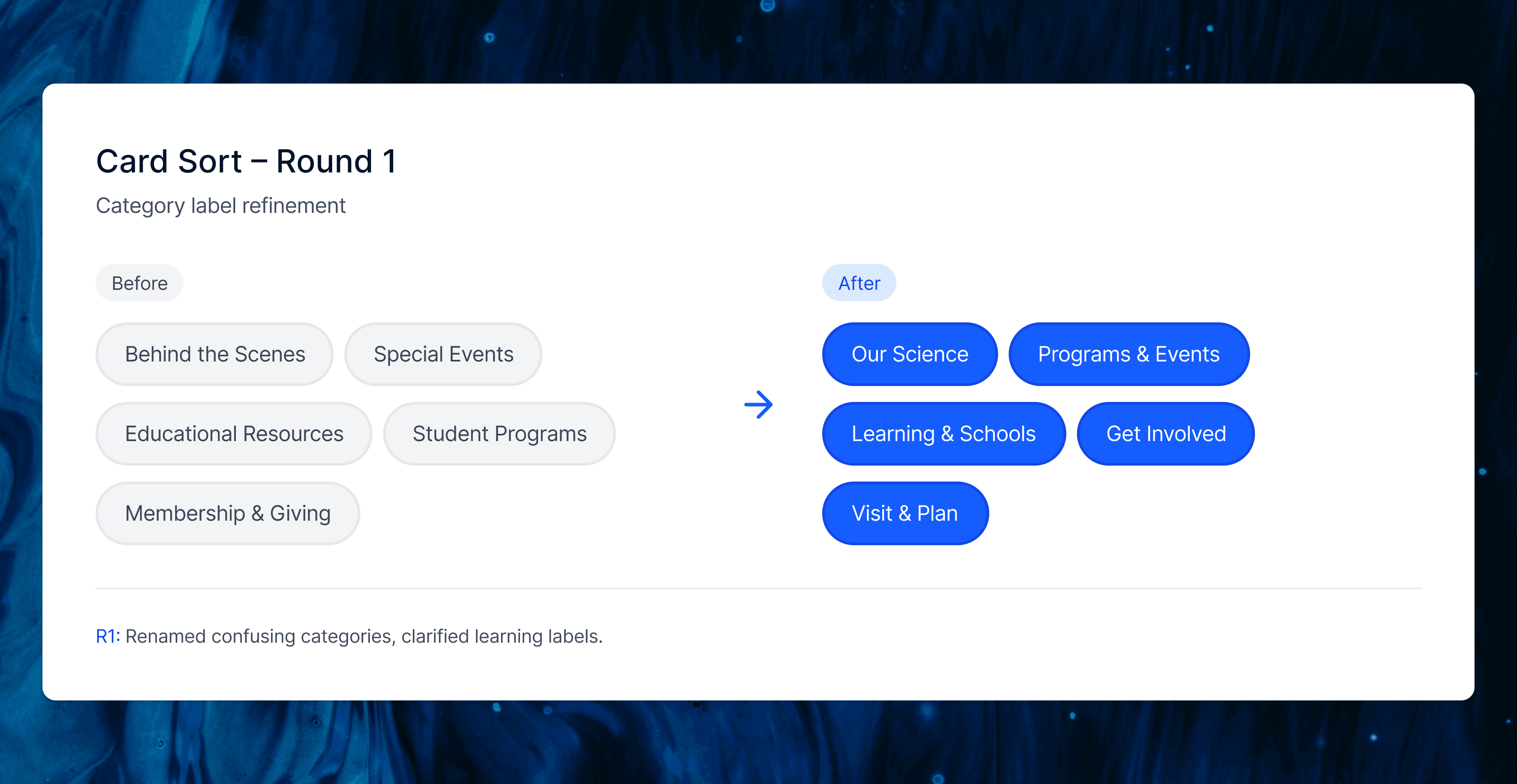
Card Sort R1
In Round 1, we tested our first set of renamed categories to see if the pilot changes actually reduced confusion. Most visit related items landed correctly, but labels like “Behind the Scenes,” “Special Events,” and some learning cards were still unclear, especially “For Educators” and “Community Science.”
We used this round to simplify the screener, clarify card names (for example, “Programs for Kids and Families”), and prepare a cleaner structure for Round 2.
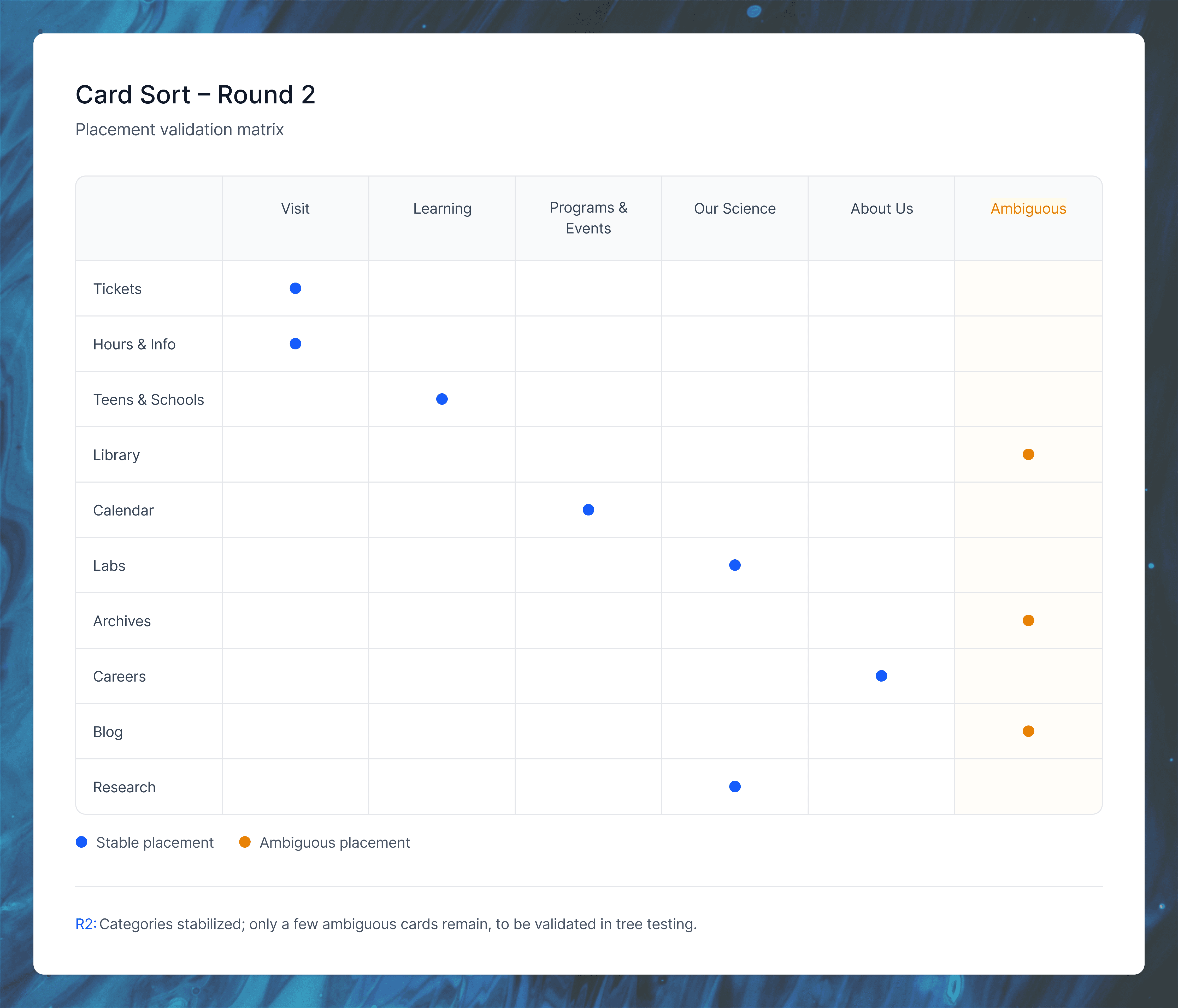
Card Sort R2
In Round 2, the updated labels performed more consistently. Most cards fell into their expected categories and confusion around “Our Science,” programs, and learning content dropped. Only a small cluster of items (like Press Room, Library, Archives, Accessibility, Groups, and Annual Memberships) remained ambiguous, which we resolved using IA judgment and planned to validate in tree testing. This round confirmed that the core category structure was now stable enough to move forward.
Tree testing
Why Tree Testing Mattered ?
Card sorting gave us user groupings and labels, but tree testing was crucial to validate whether people could actually find content in our proposed hierarchy (turning bottom-up insights into top-down navigation that worked).
We tested four key tasks:
Finding current exhibits
Parking info
Detailed research resources (like ancient Egypt)
Age-specific learning content
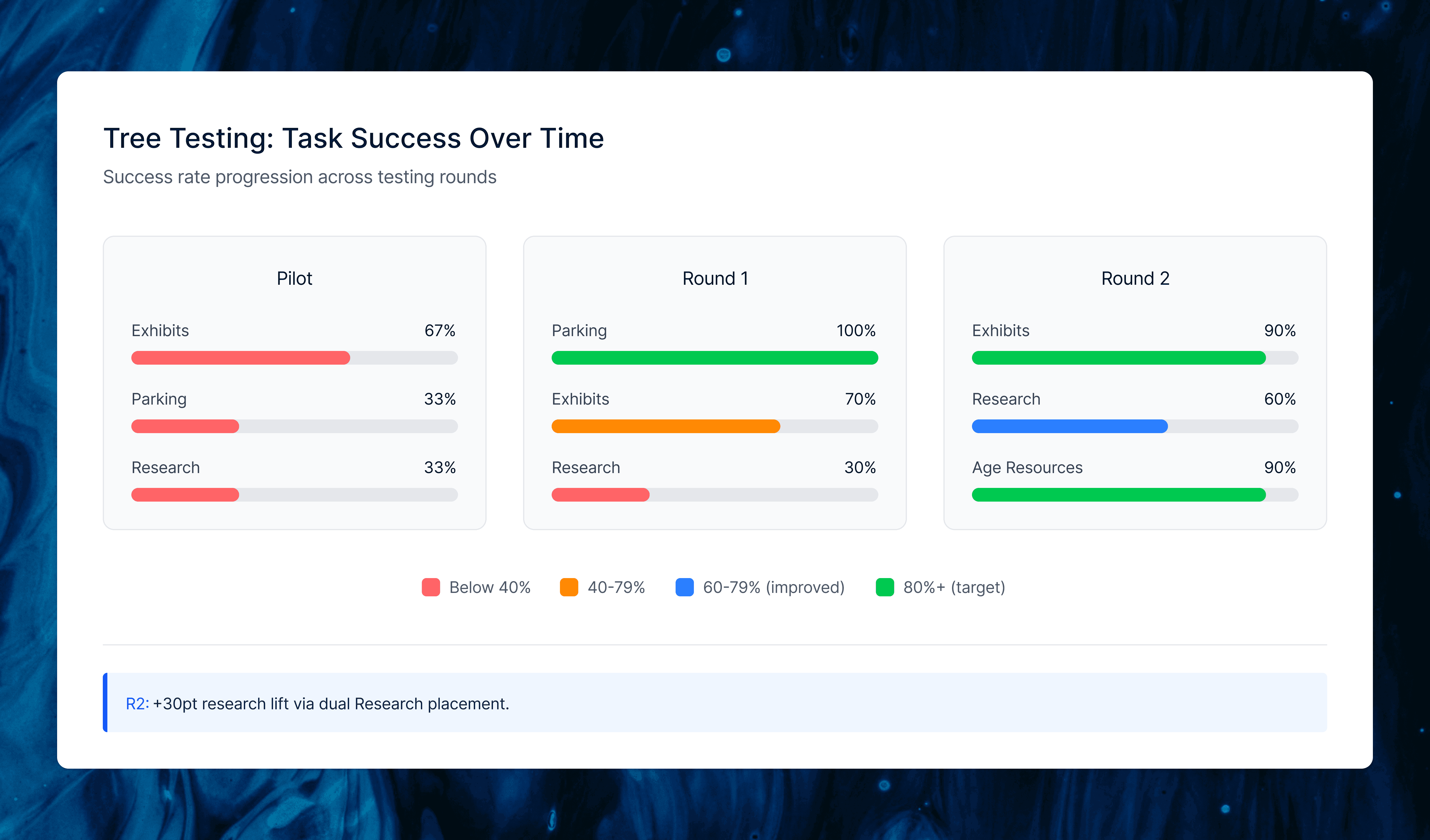
The pilot showed low success (66.7% exhibits, 33.3% parking/research), so we consolidated exhibitions into one card and added explicit parking.
Round 1 improved parking to 100% and exhibits to 70%, but research stayed low (30%) since users looked under Learning instead of Our Science.
For Round 2, we moved Exhibitions higher under Visit, dually placed Research under both Learning and Research & Science, and refined prompts, boosting exhibits to 90%, research to 60% (+30 points), and age-specific resources to 90%. This confirmed our IA was now findable and set the foundation for the final sitemap.
Site Map
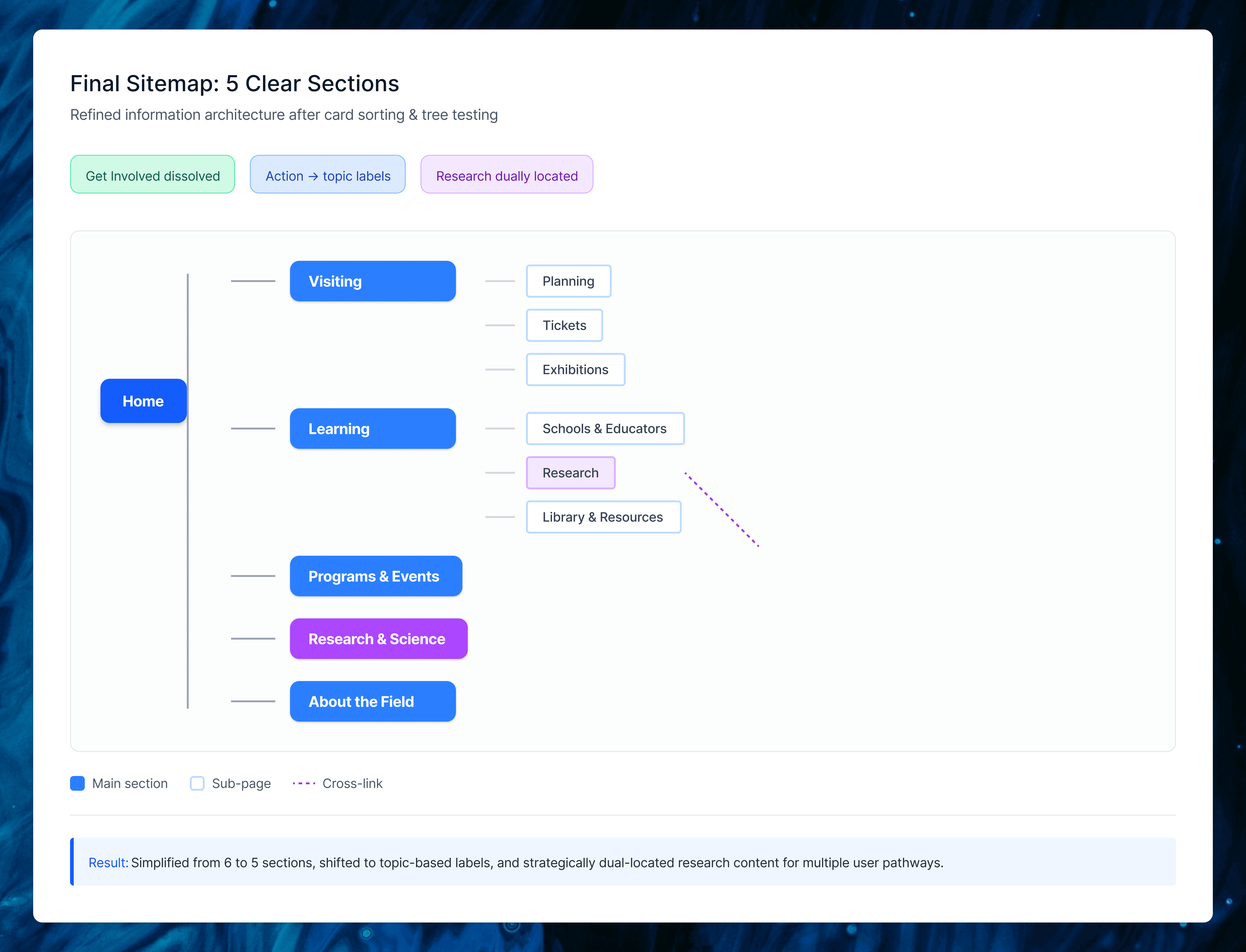
The final sitemap synthesized all our research into five clear top-level sections: Visiting, Learning, Programs & Events, Research & Science, and About the Field. We eliminated the redundant “Get Involved” category by redistributing Volunteering, Internships, and Community Service to more intuitive homes, removed duplicate links, and renamed action-based labels to topic-based ones (Events → Programs & Events, Our Science → Research & Science).
The biggest decision was dually locating “Research” under both Learning and Research & Science. Tree testing showed users expected academic content in both places, so we made it findable wherever they looked. This structure directly reflected card sort groupings and tree test paths, creating navigation that matched visitor mental models.
Wireframe
I took full ownership of the wireframes, directly translating heuristic analysis findings into two redesigned flows: ticket purchasing and exhibitions browsing. Where the evaluation exposed navigation gaps and mental model mismatches, I created concrete UI solutions that embodied our tested IA.
The ticket flow became a single scrollable page consolidating all decisions like ticket type, date, quantity, add-ons, and review, eliminating multi-page jumps and browser-back dependency that frustrated users. Selected menu items now use card-style interactions with blue feedback states, and the hamburger menu shows clearer sub-navigation.
The exhibitions flow features a featured exhibit carousel at top, followed by filterable “All Current Exhibitions,” with detail pages chunked into scannable sections (overview, highlights, staff, events). This addressed card/button confusion from heuristics while supporting quick scanning and deeper exploration.

Conclusion
Key Takeaways: Our research uncovered mixed navigation causing menu confusion, deep nesting beyond level 4 that users rarely reached, and a clear preference for single-screen information over multi-page splits. The redesigned IA with five clear sections, topic-based labels, and dual Research placement directly addressed these issues, boosting tree test success from as low as 33% in the pilot to 90% on key tasks like exhibits and resources. What I Learned: This project showed how tightly IA decisions must connect to real user evidence. Small changes like label tweaks and dual placements created measurable findability improvements. Balancing my business perspective on revenue driving visuals with my teammates’ user focus led to recommendations that served both the museum’s goals and visitor needs, with next steps like first-click testing ready to build on this work.
Arjun
